
Graphic Design: Art Direction / Brand Identity / Marketing
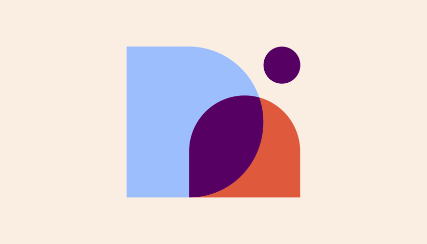
Two arched shapes intertwine to create a stable and balanced mark, while an energetic dot aligns to their point of intersection, lending movement as it leads the eye upward. The shapes that make up our logo are actually inspired by the "D” and the “n” in Designerds — they’re the same shape in two different sizes. Designerds (that’s us!) are a literal bridge between client and service. We've made the dot and the overlap the same color to visually connect the two because together, they can be interpreted as a person (with the dot being the head and the overlap the body), representing the Designerd in the middle. This humanizes our brand and makes us friendly and approachable - which we are in real life, too! Designerds are great people and the perfect complement to any brand.